20 Stunning Winter Family Photo Outfits That Will Make Your Holiday Cards Unforgettable
Every year, families go through the same stress before photo day, even after planning everything in advance. Outfit choices that once felt perfect suddenly seem wrong, especially with the pressure of creating photos that will be shared as holiday cards. The key isn’t matching outfits but creating a coordinated look that feels natural and reflects each family member’s personality. These winter outfit ideas focus on balance—stylish, festive, and timeless—so photos feel special for years without looking forced.
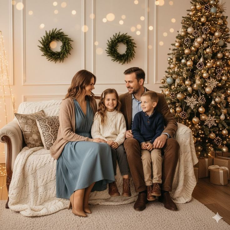
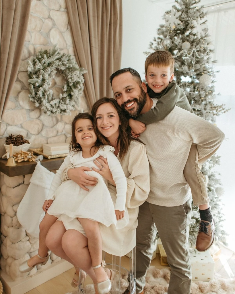
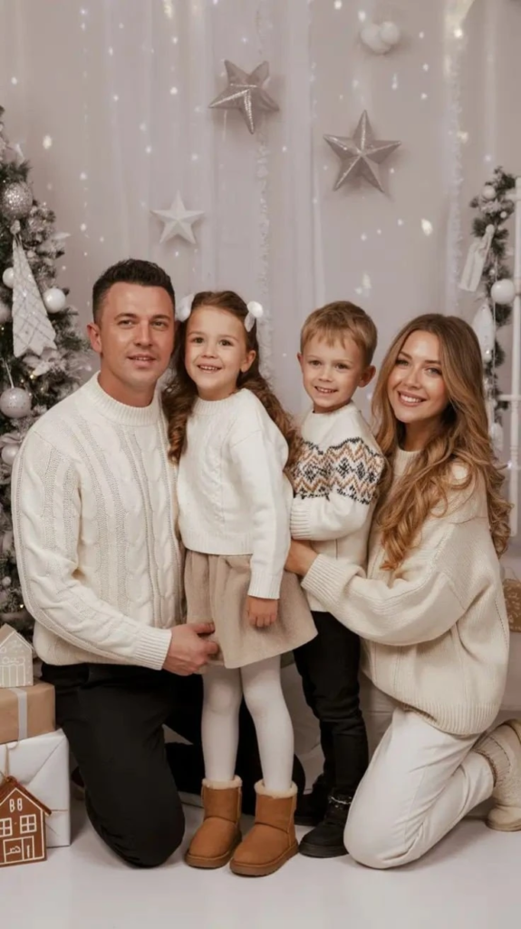
Neutral Tones And Cream Elegance
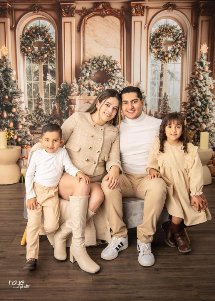
This look highlights how soft neutral shades can feel luxurious without being overwhelming. Creams, beiges, and whites work together to create a polished appearance that photographs well in festive settings. Each family member wears a different style while staying within the same color family, allowing individuality without visual clutter. The simplicity of neutral tones keeps attention on expressions and connection rather than clothing.
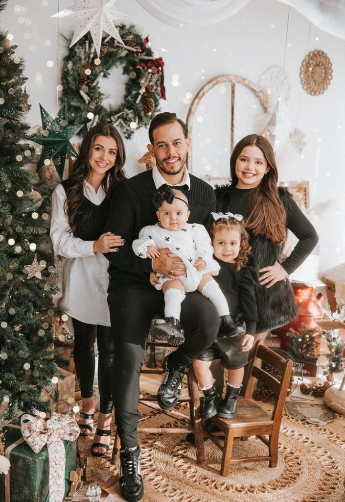
Elegant Black And White Formal Family Ensemble
Black and white outfits create a refined and classic appearance that never goes out of style. The contrast between dark and light pieces adds structure while remaining visually clean. This palette works well with almost any background and adapts easily to both formal and relaxed photo settings. The result is a timeless family portrait that feels elegant without trying too hard.
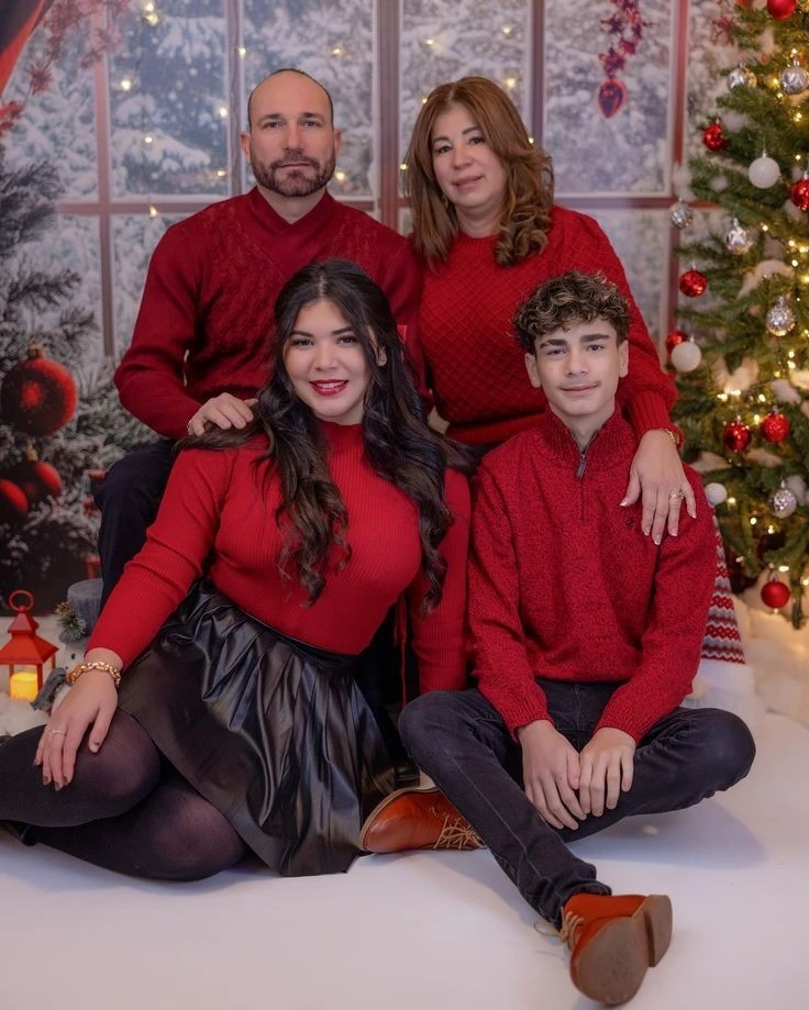
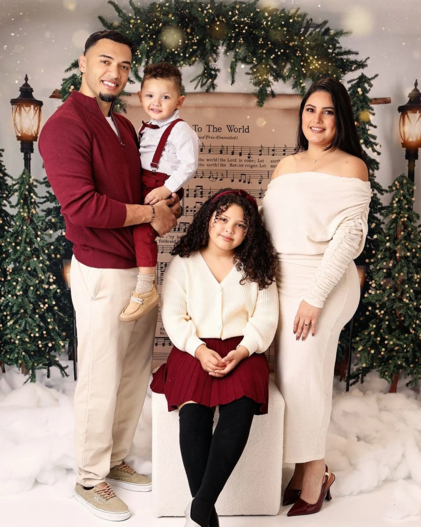
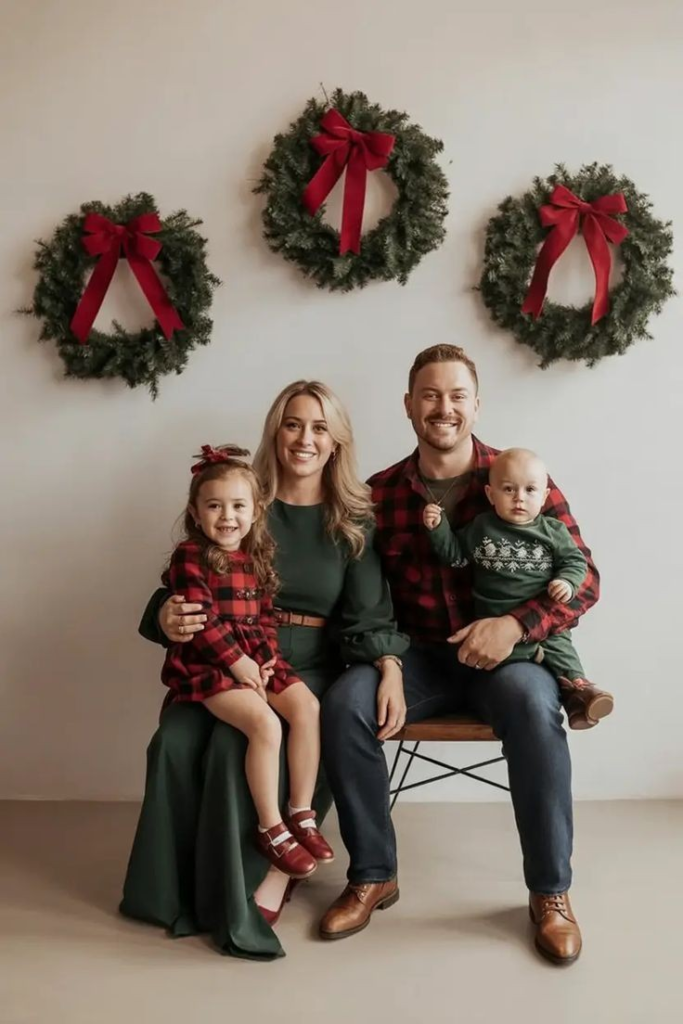
Classic Red And Cream Family Coordination
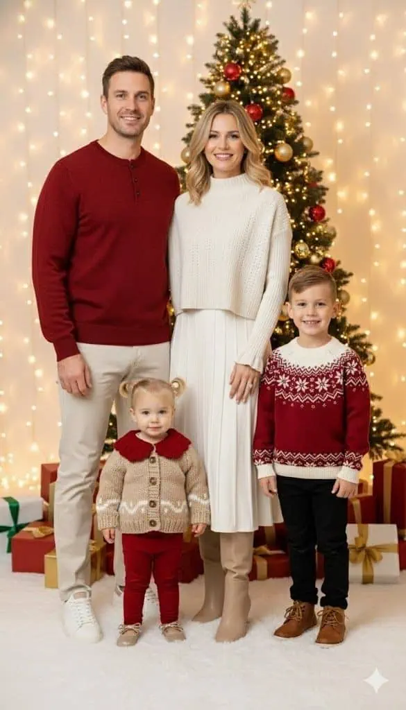
Red paired with cream offers a warm and traditional holiday feel without being overpowering. Each family member contributes to the color story in a slightly different way, keeping the look coordinated but not identical. Soft lighting and neutral surroundings enhance the richness of the colors. This combination feels cozy, thoughtful, and suitable for families of all ages.
Warm Neutrals With Elegant Layering
This outfit approach uses warm neutrals and layered textures to create depth and visual interest. Soft knits, flowing fabrics, and complementary tones give the family a unified yet relaxed appearance. Layering helps each person stand out while still feeling connected to the group. The overall look is polished, comfortable, and timeless for holiday photos.
Cozy Neutral Tones At The Pumpkin Patch

Earthy neutral shades work beautifully in outdoor seasonal settings. Creams, tans, and muted browns blend naturally with rustic backdrops while keeping the family visually cohesive. Each outfit feels relaxed but intentional, proving that understated colors can still make a strong impact. The result is a warm, inviting photo that feels natural and effortless.
Classic Black And White Elegance
This black and white styling focuses on clean lines and balanced coordination. Matching tones across different clothing styles help maintain harmony without distraction. The simplicity of the palette ensures that facial expressions and family interaction remain the focus. Combined with a festive background, the look feels refined and memorable.
Elegant Neutrals With Festive Accents
Soft neutral colors paired with subtle festive details create a balanced holiday look. Texture and layering add interest while keeping the palette calm and cohesive. Small personal touches help each outfit feel unique without breaking the overall harmony. This style feels elegant, seasonal, and suitable for timeless holiday cards.
Classic Red Sweaters With Modern Flair
This look shows how one color theme can still feel dynamic. Different shades and textures of red are paired with darker neutrals to avoid looking overly matched. The combination feels festive yet stylish and easy to recreate with everyday winter pieces. It’s a practical option that still looks intentional and photo-ready.
Neutral Tones With Coordinated Elegance
A soft neutral palette brings warmth and unity to family photos. Textured fabrics and flowing silhouettes prevent the outfits from feeling flat or boring. This approach keeps the focus on connection and emotion rather than bold fashion statements. The result is a calm, elegant portrait that works across many settings.
Warm Neutrals With Cozy Knit Textures
Mixing knits and soft fabrics in warm neutral shades creates a comfortable and welcoming look. The combination feels relaxed while still looking carefully styled. Different textures help add depth, especially in winter settings. This style balances comfort and polish perfectly for holiday photography.
Warm Neutrals With Festive Red Accents
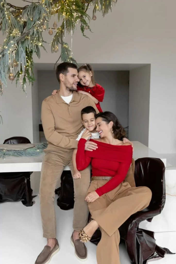
Neutral bases paired with controlled pops of red create a festive but refined effect. The red elements draw attention without overpowering the overall look. Each family member contributes to the color balance in their own way. This coordination feels modern, joyful, and visually engaging.
Warm Neutrals With Coordinated Brown Accents

Brown tones layered into a neutral palette add richness and warmth. The outfits feel connected without being overly styled or repetitive. Each person’s look complements the others while still feeling personal. This approach keeps photos natural and timeless.
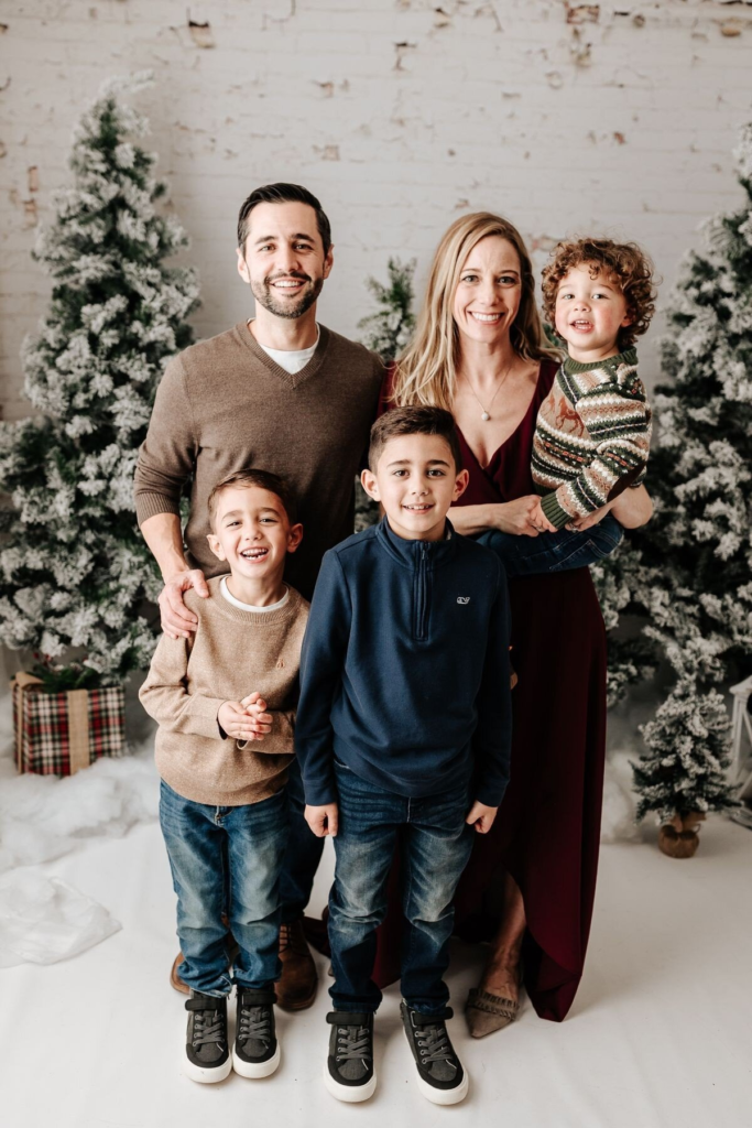
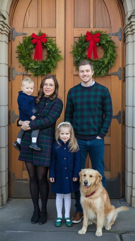
Rich Navy And Neutral Comfort
Navy tones bring depth and elegance when paired with warm neutrals. The balance between structured pieces and soft layers creates a polished yet comfortable appearance. This combination works well for families who want a refined look without stiffness. The final result feels calm, cozy, and classic.
Coordinated Cream And Neutral Knits
Cream and beige knits create a soft, unified family look that feels effortless. Texture plays a key role in keeping the outfits visually interesting. The neutral palette ensures the focus stays on emotion and connection. This styling choice remains timeless and versatile year after year.
Classic Plaid And Jewel-Tone Elegance
Plaid patterns paired with rich jewel tones add sophistication without overwhelming the photo. The mix of patterns and solids feels balanced and intentional. This approach works well for families who prefer a traditional, polished look. The overall style feels classic and well-put-together.
Jewel Tones With Coordinated Family Elegance
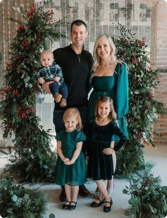
Deep jewel tones bring richness and visual impact to winter photos. Different silhouettes and textures allow each family member to express individuality. The shared color family keeps the look cohesive without matching exactly. The final image feels elegant, intentional, and festive.
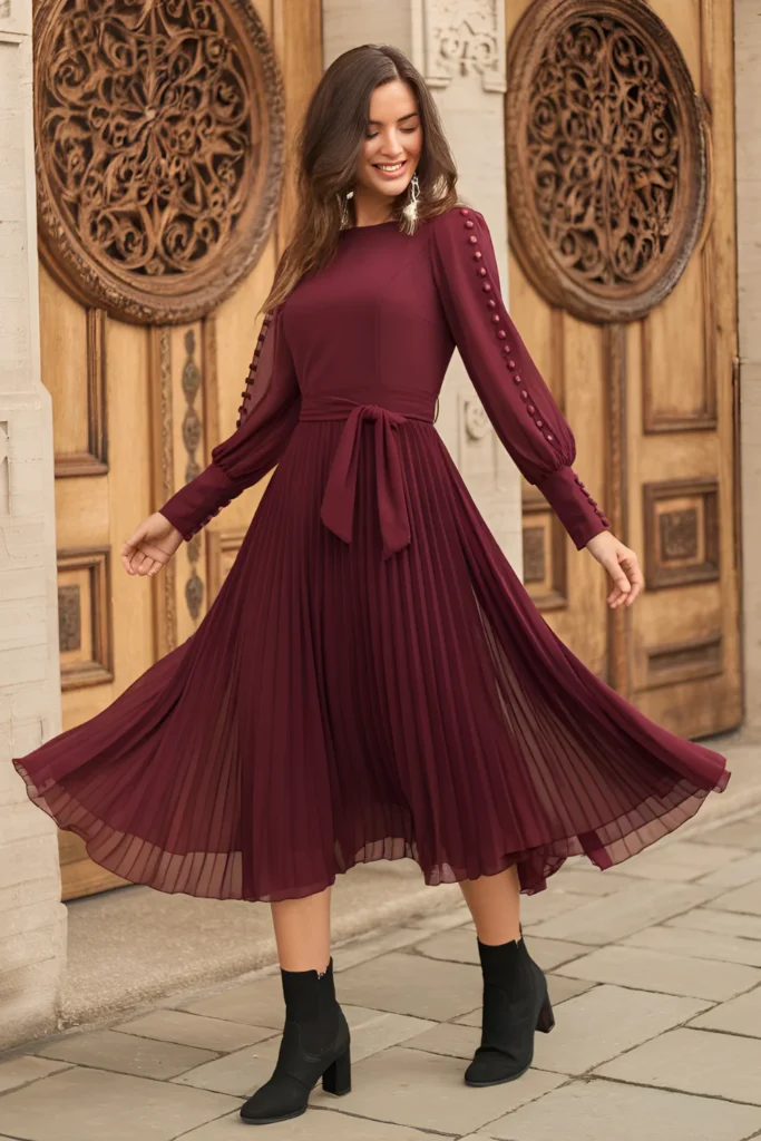
Elegant Burgundy And Cream Family Palette
Burgundy combined with soft neutrals creates a warm and refined holiday aesthetic. The balance between dark and light tones prevents the outfits from feeling heavy. Each family member’s look contributes to the overall harmony. This palette photographs beautifully and feels timeless.
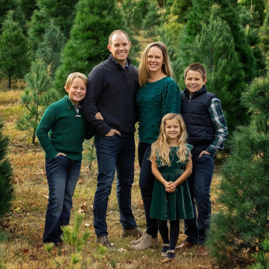
Classic Plaid And Forest Green Coordination
Forest green and plaid offer a strong seasonal feel without appearing costume-like. The coordinated colors unify the family while allowing flexibility in outfit choices. Accessories and textures add depth without distraction. This look feels traditional, warm, and suitable for all ages.
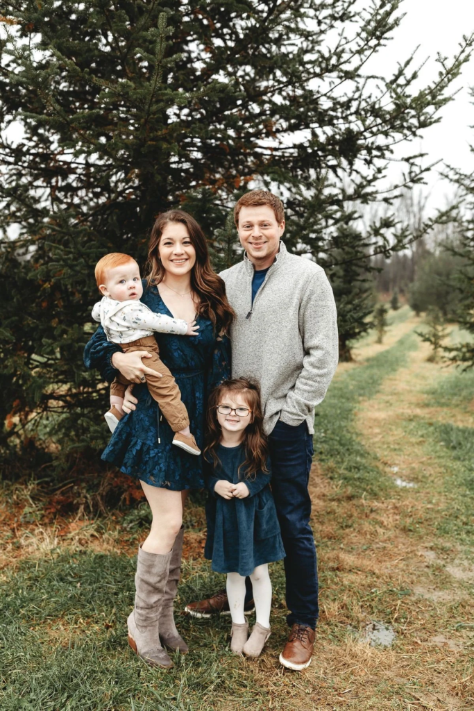
Jewel Tones With Navy Accents
Emerald and navy tones create a rich yet grounded color story. The coordination feels polished without being overly formal. Layered textures help maintain visual interest across the group. This combination translates well to both printed and digital holiday cards.
Cozy Neutrals In A Snowy Forest
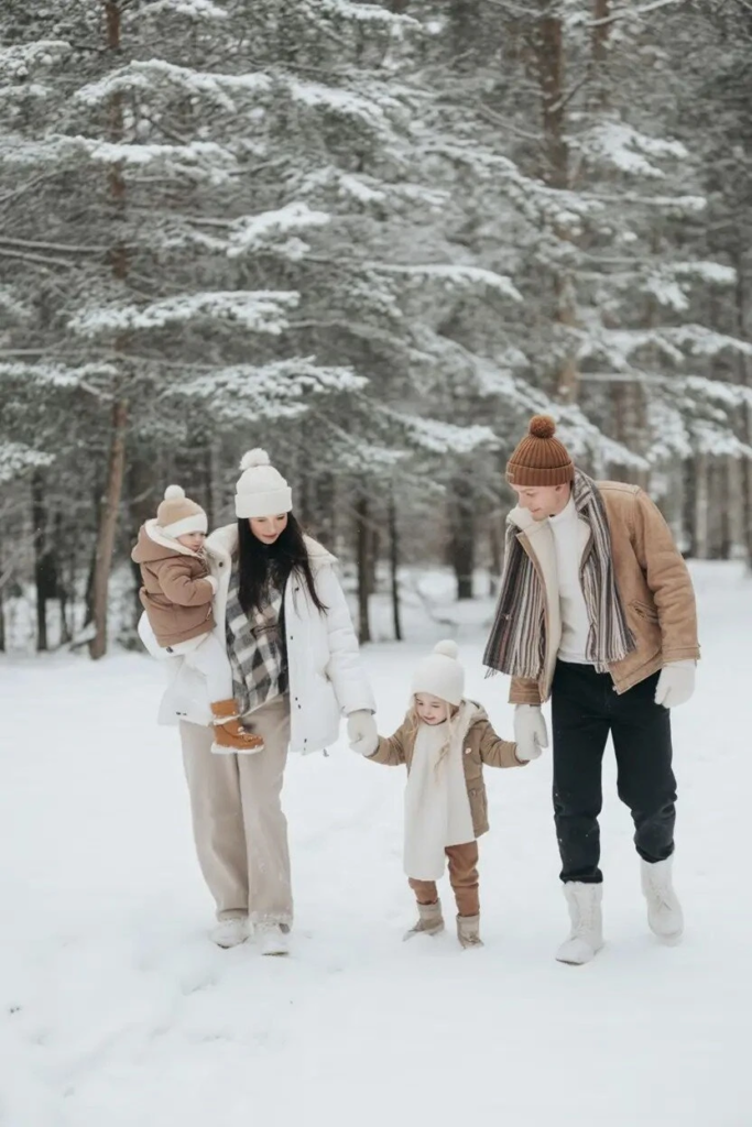
Soft neutrals paired with winter layers create a naturally elegant look. The snowy backdrop enhances the warmth of the color palette. Different textures keep the outfits visually engaging while remaining cohesive. This styling feels authentic, cozy, and timeless for winter family photos.